As a developer and designer, I’ve always been passionate about creating beautiful, functional interfaces that are both visually appealing and practical. One of the most recent projects I worked on involved developing a Dark Neumorphism Clock. This clock features a live animated design with real-time transitions, smooth animations, and glowing effects. Below is the breakdown of the project, the process I used to create the design, and how you can build this modern UI from scratch.
What is Neumorphism?
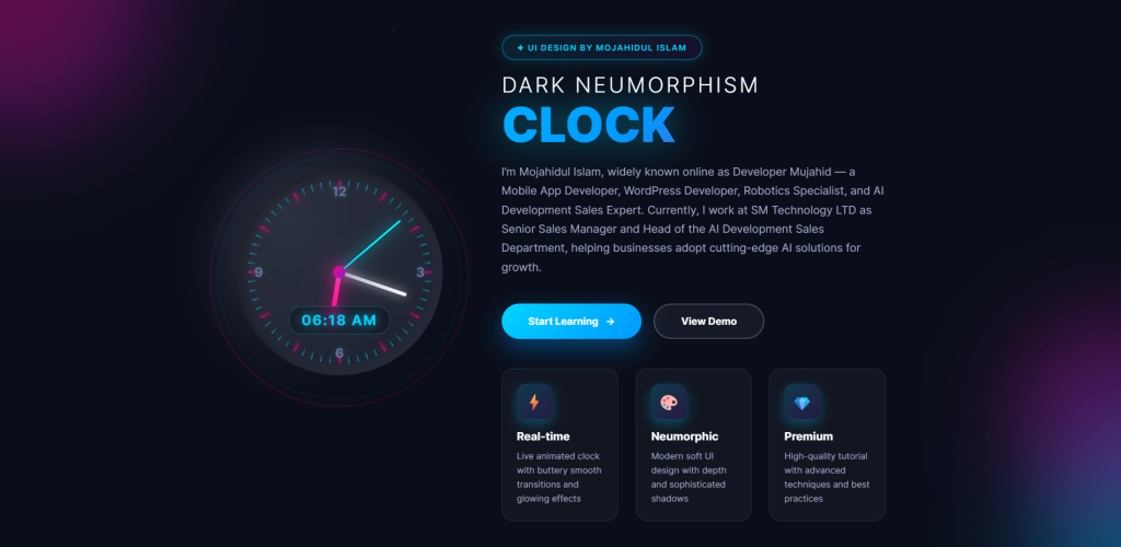
Neumorphism, also known as soft UI, is a design trend that combines flat design with subtle, inner shadow effects that give elements a soft, extruded, and almost 3D appearance. This design style has grown in popularity due to its sleek, modern aesthetic that offers a more tactile and immersive user experience. The Dark Neumorphism Clock is an excellent example of this trend, with its glowing, smooth animations, and modern interface.
Features of the Dark Neumorphism Clock
- Real-Time Clock
- The clock updates in real-time with smooth transitions and animations, making it a dynamic element in any web or app design.
- Neumorphic Design
- The clock’s design features soft, glowing, and rounded edges that create a clean, modern look. The combination of light and shadow gives it an elegant feel, as if the clock is part of the background.
- Premium Feel
- This design isn’t just about looks—it’s built to offer high-quality interactions. The glowing effects and the subtle depth created by neumorphism deliver a premium user experience.
- Interactive
- Besides showing the time, the clock includes buttons to ‘Start Learning’ and ‘View Demo’, providing interactivity. These buttons are designed to blend seamlessly into the interface without disturbing the design’s minimalism.
How to Build the Dark Neumorphism Clock
If you’re interested in building a similar clock for your own projects, here’s a step-by-step guide to help you create it:
- Setting Up the Base Structure:
The clock itself is a combination of CSS and HTML. We’ll start by creating the base HTML structure for the clock and its surrounding container. - CSS Styling for Neumorphism:
To achieve the neumorphism effect, we’ll usebox-shadowandbackgroundproperties to create depth and lighting effects. We’ll also employborder-radiusto make the clock and buttons appear soft and rounded. - Real-Time Functionality with JavaScript:
We’ll use JavaScript to update the time every second and animate the clock’s hands. The code will also ensure smooth transitions to avoid abrupt changes, providing a better user experience. - Responsive and Interactive Elements:
The buttons—‘Start Learning’ and ‘View Demo’—need to be styled using neumorphism principles, making them appear as part of the design. We’ll also make them interactive so users can engage with them.
<!DOCTYPE html>
<html lang="en">
<head>
<meta charset="UTF-8">
<meta name="viewport" content="width=device-width, initial-scale=1.0">
<title>Dark Neumorphism Clock - UI Design Tutorial</title>
<style>
* {
margin: 0;
padding: 0;
box-sizing: border-box;
}
body {
font-family: 'Inter', 'Segoe UI', sans-serif;
background: #0a0e1a;
min-height: 100vh;
display: flex;
align-items: center;
justify-content: center;
overflow-x: hidden;
position: relative;
}
/* Animated Background */
.bg-animation {
position: fixed;
width: 100%;
height: 100%;
top: 0;
left: 0;
z-index: 0;
overflow: hidden;
}
.gradient-orb {
position: absolute;
border-radius: 50%;
filter: blur(80px);
opacity: 0.4;
animation: float 20s ease-in-out infinite;
}
.orb-1 {
width: 500px;
height: 500px;
background: radial-gradient(circle, #ff0080, #7928ca);
top: -250px;
left: -250px;
animation-delay: 0s;
}
.orb-2 {
width: 400px;
height: 400px;
background: radial-gradient(circle, #00d4ff, #0099ff);
bottom: -200px;
right: -200px;
animation-delay: -7s;
}
.orb-3 {
width: 350px;
height: 350px;
background: radial-gradient(circle, #7928ca, #ff0080);
top: 50%;
right: -175px;
animation-delay: -14s;
}
@keyframes float {
0%, 100% {
transform: translate(0, 0) scale(1);
}
33% {
transform: translate(100px, -100px) scale(1.1);
}
66% {
transform: translate(-50px, 100px) scale(0.9);
}
}
/* Particles */
.particles {
position: fixed;
width: 100%;
height: 100%;
top: 0;
left: 0;
z-index: 1;
pointer-events: none;
}
.particle {
position: absolute;
width: 3px;
height: 3px;
background: rgba(0, 212, 255, 0.6);
border-radius: 50%;
animation: particleFloat 15s linear infinite;
}
@keyframes particleFloat {
0% {
transform: translateY(100vh) translateX(0) scale(0);
opacity: 0;
}
10% {
opacity: 1;
}
90% {
opacity: 1;
}
100% {
transform: translateY(-100vh) translateX(100px) scale(1);
opacity: 0;
}
}
.container {
position: relative;
z-index: 2;
display: flex;
align-items: center;
justify-content: center;
gap: 100px;
padding: 40px;
max-width: 1500px;
animation: fadeIn 1s ease-out;
}
@keyframes fadeIn {
from {
opacity: 0;
transform: translateY(30px);
}
to {
opacity: 1;
transform: translateY(0);
}
}
.clock-container {
position: relative;
animation: floatIn 1.2s ease-out;
}
@keyframes floatIn {
from {
opacity: 0;
transform: translateX(-50px) scale(0.9) rotate(-10deg);
}
to {
opacity: 1;
transform: translateX(0) scale(1) rotate(0deg);
}
}
/* Glow rings around clock */
.glow-ring {
position: absolute;
border-radius: 50%;
border: 2px solid;
animation: pulse-ring 3s ease-out infinite;
}
.ring-1 {
width: 380px;
height: 380px;
border-color: rgba(0, 212, 255, 0.3);
top: 50%;
left: 50%;
transform: translate(-50%, -50%);
animation-delay: 0s;
}
.ring-2 {
width: 420px;
height: 420px;
border-color: rgba(255, 0, 128, 0.2);
top: 50%;
left: 50%;
transform: translate(-50%, -50%);
animation-delay: 1s;
}
@keyframes pulse-ring {
0% {
transform: translate(-50%, -50%) scale(0.95);
opacity: 0;
}
50% {
opacity: 1;
}
100% {
transform: translate(-50%, -50%) scale(1.1);
opacity: 0;
}
}
.clock {
width: 350px;
height: 350px;
border-radius: 50%;
background: #1a1f2e;
box-shadow:
25px 25px 75px #0a0e1a,
-25px -25px 75px #2a2f3e,
inset 8px 8px 20px rgba(0, 0, 0, 0.5),
inset -8px -8px 20px rgba(255, 255, 255, 0.05);
position: relative;
display: flex;
align-items: center;
justify-content: center;
animation: clockHover 4s ease-in-out infinite;
transition: transform 0.3s ease;
}
@keyframes clockHover {
0%, 100% {
transform: translateY(0px);
}
50% {
transform: translateY(-10px);
}
}
.clock:hover {
transform: scale(1.05) !important;
}
.clock::before {
content: '';
position: absolute;
width: 100%;
height: 100%;
border-radius: 50%;
background: radial-gradient(circle at 25% 25%, rgba(255, 255, 255, 0.08), transparent);
pointer-events: none;
}
/* Hour markers */
.markers {
position: absolute;
width: 100%;
height: 100%;
}
.marker {
position: absolute;
width: 2px;
height: 12px;
background: linear-gradient(180deg, rgba(0, 212, 255, 0.6), rgba(0, 212, 255, 0.2));
top: 20px;
left: 50%;
transform-origin: center 155px;
margin-left: -1px;
border-radius: 2px;
}
.marker.major {
height: 18px;
width: 3px;
margin-left: -1.5px;
background: linear-gradient(180deg, rgba(255, 0, 128, 0.8), rgba(255, 0, 128, 0.3));
box-shadow: 0 0 10px rgba(255, 0, 128, 0.5);
}
.clock-face {
width: 310px;
height: 310px;
position: relative;
}
.number {
position: absolute;
width: 100%;
height: 100%;
text-align: center;
font-size: 22px;
font-weight: 700;
color: #6b7194;
text-shadow: 0 0 10px rgba(0, 212, 255, 0.3);
}
.number span {
display: inline-block;
position: absolute;
left: 50%;
transform: translateX(-50%);
top: 5px;
}
.number:nth-child(1) { transform: rotate(0deg); }
.number:nth-child(1) span { transform: translateX(-50%) rotate(0deg); }
.number:nth-child(2) { transform: rotate(90deg); }
.number:nth-child(2) span { transform: translateX(-50%) rotate(-90deg); }
.number:nth-child(3) { transform: rotate(180deg); }
.number:nth-child(3) span { transform: translateX(-50%) rotate(-180deg); }
.number:nth-child(4) { transform: rotate(270deg); }
.number:nth-child(4) span { transform: translateX(-50%) rotate(-270deg); }
.center-dot {
position: absolute;
width: 20px;
height: 20px;
background: linear-gradient(135deg, #ff0080, #7928ca);
border-radius: 50%;
top: 50%;
left: 50%;
transform: translate(-50%, -50%);
z-index: 10;
box-shadow:
0 0 30px rgba(255, 0, 128, 0.8),
0 0 60px rgba(121, 40, 202, 0.4);
animation: centerPulse 2s ease-in-out infinite;
}
@keyframes centerPulse {
0%, 100% {
transform: translate(-50%, -50%) scale(1);
}
50% {
transform: translate(-50%, -50%) scale(1.15);
}
}
.hand {
position: absolute;
bottom: 50%;
left: 50%;
transform-origin: bottom center;
border-radius: 10px;
transition: transform 0.5s cubic-bezier(0.4, 0.0, 0.2, 1);
}
.hour-hand {
width: 8px;
height: 90px;
background: linear-gradient(180deg, #ff0080, #ff3399);
margin-left: -4px;
box-shadow:
0 0 20px rgba(255, 0, 128, 0.8),
0 0 40px rgba(255, 0, 128, 0.4);
animation: glowPulse 2s ease-in-out infinite;
border-radius: 4px 4px 0 0;
}
.minute-hand {
width: 6px;
height: 120px;
background: linear-gradient(180deg, #ffffff, #b0b5c9);
margin-left: -3px;
box-shadow:
0 0 15px rgba(255, 255, 255, 0.6),
0 0 30px rgba(255, 255, 255, 0.3);
border-radius: 3px 3px 0 0;
}
.second-hand {
width: 3px;
height: 135px;
background: linear-gradient(180deg, #00d4ff, #0099ff);
margin-left: -1.5px;
box-shadow:
0 0 20px rgba(0, 212, 255, 1),
0 0 40px rgba(0, 212, 255, 0.5);
animation: glowPulse 1.5s ease-in-out infinite;
border-radius: 2px 2px 0 0;
}
@keyframes glowPulse {
0%, 100% {
filter: brightness(1);
}
50% {
filter: brightness(1.4);
}
}
/* Digital time display */
.digital-time {
position: absolute;
bottom: 70px;
left: 50%;
transform: translateX(-50%);
font-size: 24px;
font-weight: 700;
color: #00d4ff;
text-shadow: 0 0 20px rgba(0, 212, 255, 0.8);
letter-spacing: 2px;
background: rgba(0, 0, 0, 0.3);
padding: 8px 20px;
border-radius: 20px;
backdrop-filter: blur(10px);
border: 1px solid rgba(0, 212, 255, 0.3);
}
.content {
max-width: 650px;
animation: slideIn 1s ease-out 0.3s both;
}
@keyframes slideIn {
from {
opacity: 0;
transform: translateX(50px);
}
to {
opacity: 1;
transform: translateX(0);
}
}
.badge {
display: inline-block;
padding: 10px 24px;
background: linear-gradient(135deg, rgba(0, 212, 255, 0.1), rgba(121, 40, 202, 0.1));
border: 2px solid rgba(0, 212, 255, 0.3);
border-radius: 25px;
color: #00d4ff;
font-size: 14px;
font-weight: 600;
margin-bottom: 25px;
backdrop-filter: blur(10px);
text-transform: uppercase;
letter-spacing: 1.5px;
animation: badgePulse 3s ease-in-out infinite;
}
@keyframes badgePulse {
0%, 100% {
box-shadow: 0 0 20px rgba(0, 212, 255, 0.2);
}
50% {
box-shadow: 0 0 30px rgba(0, 212, 255, 0.4);
}
}
h1 {
font-size: 82px;
font-weight: 900;
margin-bottom: 25px;
line-height: 0.95;
}
.title-dark {
color: #ffffff;
display: block;
font-size: 36px;
font-weight: 300;
letter-spacing: 4px;
margin-bottom: 12px;
text-transform: uppercase;
}
.title-main {
background: linear-gradient(135deg, #00d4ff 0%, #0099ff 50%, #ff0080 100%);
-webkit-background-clip: text;
-webkit-text-fill-color: transparent;
background-clip: text;
background-size: 200% auto;
display: block;
animation: shimmer 4s ease-in-out infinite;
filter: drop-shadow(0 0 30px rgba(0, 212, 255, 0.5));
}
@keyframes shimmer {
0%, 100% {
background-position: 0% center;
}
50% {
background-position: 100% center;
}
}
.subtitle {
color: #a0a6c4;
font-size: 19px;
line-height: 1.7;
margin-bottom: 45px;
font-weight: 400;
}
.cta-buttons {
display: flex;
gap: 20px;
flex-wrap: wrap;
margin-bottom: 50px;
}
.btn {
padding: 18px 45px;
border-radius: 35px;
font-size: 17px;
font-weight: 700;
text-decoration: none;
transition: all 0.4s cubic-bezier(0.175, 0.885, 0.32, 1.275);
cursor: pointer;
border: none;
display: inline-flex;
align-items: center;
gap: 12px;
position: relative;
overflow: hidden;
}
.btn::before {
content: '';
position: absolute;
top: 50%;
left: 50%;
width: 0;
height: 0;
border-radius: 50%;
background: rgba(255, 255, 255, 0.2);
transform: translate(-50%, -50%);
transition: width 0.6s, height 0.6s;
}
.btn:hover::before {
width: 300px;
height: 300px;
}
.btn span {
position: relative;
z-index: 1;
}
.btn-primary {
background: linear-gradient(135deg, #00d4ff 0%, #0099ff 100%);
color: #ffffff;
box-shadow: 0 15px 40px rgba(0, 153, 255, 0.4);
}
.btn-primary:hover {
transform: translateY(-5px) scale(1.05);
box-shadow: 0 20px 50px rgba(0, 153, 255, 0.6);
}
.btn-secondary {
background: rgba(255, 255, 255, 0.05);
color: #ffffff;
border: 2px solid rgba(255, 255, 255, 0.2);
backdrop-filter: blur(10px);
}
.btn-secondary:hover {
background: rgba(255, 255, 255, 0.15);
border-color: rgba(255, 255, 255, 0.4);
transform: translateY(-5px) scale(1.05);
}
.features {
display: grid;
grid-template-columns: repeat(3, 1fr);
gap: 30px;
}
.feature {
background: rgba(255, 255, 255, 0.03);
padding: 25px;
border-radius: 20px;
border: 1px solid rgba(255, 255, 255, 0.1);
backdrop-filter: blur(10px);
transition: all 0.4s ease;
position: relative;
overflow: hidden;
}
.feature::before {
content: '';
position: absolute;
top: 0;
left: 0;
width: 100%;
height: 100%;
background: linear-gradient(135deg, rgba(0, 212, 255, 0.1), rgba(255, 0, 128, 0.1));
opacity: 0;
transition: opacity 0.4s ease;
}
.feature:hover {
transform: translateY(-8px);
border-color: rgba(0, 212, 255, 0.4);
box-shadow: 0 15px 40px rgba(0, 212, 255, 0.2);
}
.feature:hover::before {
opacity: 1;
}
.feature-icon {
width: 60px;
height: 60px;
border-radius: 15px;
background: linear-gradient(135deg, rgba(0, 212, 255, 0.2), rgba(121, 40, 202, 0.2));
display: flex;
align-items: center;
justify-content: center;
margin-bottom: 18px;
font-size: 28px;
position: relative;
z-index: 1;
box-shadow: 0 8px 20px rgba(0, 212, 255, 0.3);
}
.feature h3 {
color: #ffffff;
font-size: 19px;
margin-bottom: 10px;
font-weight: 700;
position: relative;
z-index: 1;
}
.feature p {
color: #a0a6c4;
font-size: 15px;
line-height: 1.6;
position: relative;
z-index: 1;
}
@media (max-width: 1200px) {
.container {
flex-direction: column;
gap: 60px;
}
h1 {
font-size: 64px;
}
.title-dark {
font-size: 28px;
}
}
@media (max-width: 640px) {
.clock {
width: 280px;
height: 280px;
}
.clock-face {
width: 240px;
height: 240px;
}
h1 {
font-size: 48px;
}
.title-dark {
font-size: 22px;
}
.features {
grid-template-columns: 1fr;
}
.ring-1, .ring-2 {
display: none;
}
}
</style>
</head>
<body>
<!-- Animated Background -->
<div class="bg-animation">
<div class="gradient-orb orb-1"></div>
<div class="gradient-orb orb-2"></div>
<div class="gradient-orb orb-3"></div>
</div>
<!-- Particles -->
<div class="particles" id="particles"></div>
<div class="container">
<div class="clock-container">
<div class="glow-ring ring-1"></div>
<div class="glow-ring ring-2"></div>
<div class="clock">
<div class="markers" id="markers"></div>
<div class="clock-face">
<div class="number"><span>12</span></div>
<div class="number"><span>3</span></div>
<div class="number"><span>6</span></div>
<div class="number"><span>9</span></div>
<div class="hand hour-hand" id="hourHand"></div>
<div class="hand minute-hand" id="minuteHand"></div>
<div class="hand second-hand" id="secondHand"></div>
<div class="center-dot"></div>
</div>
<div class="digital-time" id="digitalTime">06:07 AM</div>
</div>
</div>
<div class="content">
<div class="badge">✦ UI Design by Mojahidul Islam</div>
<h1>
<span class="title-dark">Dark Neumorphism</span>
<span class="title-main">CLOCK</span>
</h1>
<p class="subtitle">
I’m Mojahidul Islam, widely known online as Developer Mujahid — a Mobile App Developer, WordPress Developer, Robotics Specialist, and AI Development Sales Expert. Currently, I work at SM Technology LTD as Senior Sales Manager and Head of the AI Development Sales Department, helping businesses adopt cutting-edge AI solutions for growth.
</p>
<div class="cta-buttons">
<a href="#" class="btn btn-primary">
<span>Start Learning</span>
<span>→</span>
</a>
<a href="#" class="btn btn-secondary">
<span>View Demo</span>
</a>
</div>
<div class="features">
<div class="feature">
<div class="feature-icon">⚡</div>
<h3>Real-time</h3>
<p>Live animated clock with buttery smooth transitions and glowing effects</p>
</div>
<div class="feature">
<div class="feature-icon">🎨</div>
<h3>Neumorphic</h3>
<p>Modern soft UI design with depth and sophisticated shadows</p>
</div>
<div class="feature">
<div class="feature-icon">💎</div>
<h3>Premium</h3>
<p>High-quality tutorial with advanced techniques and best practices</p>
</div>
</div>
</div>
</div>
<script>
// Create hour markers
const markersContainer = document.getElementById('markers');
for (let i = 0; i < 60; i++) {
const marker = document.createElement('div');
marker.className = i % 5 === 0 ? 'marker major' : 'marker';
marker.style.transform = `rotate(${i * 6}deg)`;
markersContainer.appendChild(marker);
}
// Create particles
const particlesContainer = document.getElementById('particles');
for (let i = 0; i < 30; i++) {
const particle = document.createElement('div');
particle.className = 'particle';
particle.style.left = Math.random() * 100 + '%';
particle.style.animationDelay = Math.random() * 15 + 's';
particle.style.animationDuration = (Math.random() * 10 + 10) + 's';
particlesContainer.appendChild(particle);
}
// Update clock
function updateClock() {
const now = new Date();
const hours = now.getHours();
const minutes = now.getMinutes();
const seconds = now.getSeconds();
const milliseconds = now.getMilliseconds();
// Smooth second hand movement
const secondDeg = (seconds + milliseconds / 1000) * 6;
const minuteDeg = (minutes + seconds / 60) * 6;
const hourDeg = ((hours % 12) + minutes / 60) * 30;
document.getElementById('hourHand').style.transform = `rotate(${hourDeg}deg)`;
document.getElementById('minuteHand').style.transform = `rotate(${minuteDeg}deg)`;
document.getElementById('secondHand').style.transform = `rotate(${secondDeg}deg)`;
// Update digital time
const ampm = hours >= 12 ? 'PM' : 'AM';
const displayHours = hours % 12 || 12;
const displayMinutes = minutes.toString().padStart(2, '0');
document.getElementById('digitalTime').textContent =
`${displayHours.toString().padStart(2, '0')}:${displayMinutes} ${ampm}`;
}
updateClock();
setInterval(updateClock, 50); // Update more frequently for smooth animation
// Interactive button effects
document.querySelectorAll('.btn').forEach(btn => {
btn.addEventListener('click', (e) => {
e.preventDefault();
btn.style.transform = 'scale(0.95)';
setTimeout(() => {
btn.style.transform = '';
}, 150);
});
});
</script>
</body>
</html>
Explanation of Code
-
HTML Structure:
The clock is placed inside a circular container (clock-container), which is centered on the page. The time is displayed in thetime-displaysection, and two interactive buttons are added underneath it. -
CSS Styling:
-
Neumorphism is achieved through the use of
box-shadow, making the clock appear soft, rounded, and raised. -
The hands of the clock are animated using
@keyframesto create the real-time effect. -
The buttons are styled with glowing shadows and hover effects that make them interactive.
-
-
JavaScript:
-
The JavaScript function updates the displayed time every second using
setInterval(). It fetches the current time, formats it, and updates the clock on the screen.
-
Conclusion
The Dark Neumorphism Clock is an elegant, real-time animated design that blends modern neumorphic design trends with smooth animations and glowing effects. By combining HTML, CSS, and JavaScript, we can create dynamic, engaging user interfaces that not only look great but also function beautifully. Whether you’re building a clock for a personal project or adding an interactive element to a website or app, this design offers a premium feel that will captivate your audience.
Feel free to use this code as a starting point for your own projects. Happy coding!